Monday, January 30, 2006

George Foster


A member of the Cincinatti Reds' during their "Big Red Machine" years, along with Pete Rose, Johnny Bench, Dave Concepcion and Joe Morgan, to name a few.
Somewhere along the line I misplaced the sketches for this drawing, which is too bad, because I'd like to see what the evolution/struggle was for this drawing. I remember there was something in the photo of Foster I was working from that reminded me of a wierd combination of a cubist painting and Kabuki makeup, so I tried to combine the two and came up with this, one of my favorites from this group. It was drawn with a charcoal pencil, spray-fixed then painted with acrylics.

Bill "Moose" Skowron


First baseman, power hitter and hero of the 1958 World Series for the Yankees (featuring teammates Mickey Mantle and Yogi Berra) over the Braves (that's the Milwaukee Braves by the way, featuring Hank Aaron and Warren Spahn) Moose seemed to hit a lot of dramatic game-ending home runs, more than a couple of them Grand Slams. Even though I've never been a Yankees fan (with the occasional exception, when some Yankee did something just too amazing not to be impressed, like Reggie Jackson's three home runs off of three different pitchers in the '77 Series over the loathsome Dodgers) how could I resist drawing a guy nicknamed Moose with a face like this! Like a lot of the older players in this series of drawings, Moose pretty much caricatured himself, as you can see from the minimal evolution of the sketches to the finish. Sometimes getting the look of the face is a struggle for me, requiring more looking and more work, more false starts, and sometimes it just seems to emerge on its own.

Friday, January 27, 2006

Ferris Fain


Another player from the 50's about whom I know next to nothing, but I liked his face a lot. Ferris Fain played 1st base for the Philadelphia A's. That's all I got, stat-wise, but isn't that a great face?

Willie McGee


Since the Giants were usually long gone by October for the most part, I'd see a lot of the other teams and their players in post-season play. Seems like for a while there, (okay, still) the St. Louis Cardinals were always finding a way into the playoffs, if not the World Series then at least the League Championship. In the 80's that meant seeing lots of closeups of guys like Willie McGee, who was a consistent hitter and a rabbit on the basepaths. He was perfect for caricature, (as was Ozzie Smith, whom I have yet to do) and when I found a good shot to work from, I decided to set aside my airbrush and try straight acrylic painting, fat over lean. I also wanted to play with a different palette, just to keep the images from getting stale and predictable. I was pretty happy with the way the caricature came out on this one - I felt I pushed it as far as I had wanted.

Thursday, January 26, 2006

Don Mossi


Here's a player I know nothing about, except he pitched for the Cleveland Indians in the 50's and has a great face that begs to be caricatured - long thin and vertical, with big ears sticking way out and a mischievous look in his eyes. I had to reign in my first sketch, proportionally, as you can see here. I used to do all my initial workup drawings on tracing paper, then refine with another sheet over the first sketch, which would frequently be waaay off proportionally.
Personal political-incorrectness caveat: Being an unenlightened kid growing up in mid-60's suburbia, (ignorance is a thin excuse, I know) it never dawned on me until I was an adult how offensive the team name and logo for teams like the Redskins (YOW!) and the Indians was. I merely thought Chief Wahoo was a funny, vaguely 30's little cartoon face. Not that anyone's asking me, but the inherent racism behind the name of the team - while unfortunately the norm for 1914 - has no place in the 21st century, where we should be a whole hell of a lot more aware and evolved than to name a sports franchise after the ethnicity of the indigenous people of the continent. Such ignorant, insensitive, umm, let's say, corporate thinking that reduces an entire race and countless complex cultures to cartoonish negative stereotypes should be beneath us in this day and age. One would hope. Say, maybe they should go back to being called the Cleveland Spiders? Product tie-in with Marvel and Universal! Tobey McGuire could throw out the first pitch! Gotta dream the dream...

Ernie Banks


"Let's play two!"
A lot of these players I chose to paint because I simply liked the way their faces looked or they had a particular expression that was fun to capture. I don't know much about Ernie Banks, but I had always heard of him as a tremendously popular player for the Cubs, mostly when I'd listen to the Giants games on the radio announced by the amazing Hank Greenwald. Hank was tremendously entertaining every single game, a treasure trove of anecdotes, stats and knowledge of the game. He not only transported you to the ballpark but he expanded your knowledge of the incredible nuances of the game itself, AND he had a terrific sense of humor. I remember him describing Ernie Banks as a wonderfully enthusiastic player, always ready to play a doubleheader.

Tuesday, January 24, 2006

Rob Dibble


"Nasty Boy" Rob Dibble used to annoy the hell out of me when he pitched against the Giants. He was one of those slovenly, unkempt, and oh yeah, maddeningly effective pitchers who seemed to do really well against my team right when I really didn't want him to - at least in 1988. This piece is from his 1989 Donruss card, after his first season in the majors. I've always liked the way this one turned out, and it think it's largely because my emnity for Dibble helped fuel the success of the caricature. I usually find it harder to do a strong caricature of someone I admire than someone I dislike.

Monday, January 23, 2006

Andre Dawson


Although I've always been a Giants fan, I have a soft spot for the Cubbies as well. I've been to Wrigley Field twice - I love the environment in the ballpark and in the neighborhood surrounding it - I do like the city of Chicago. As you can see I wasn't concerning myself with backgrounds too much when I did this image (probably 1993) aside from the minimal representation of Wrigley's brick wall (right field, the position Dawson played). I pretty much decided against backgrounds after doing this one, wanting to concentrate on just the faces, which is what I was most interested in to begin with. I really liked Andre Dawson's intensity when he played for both the Expos and the Cubs, and I thought this image from the back of his '92 Score baseball card showed it well.

Friday, January 20, 2006

Baseball Faces 1 - Frank Robinson


As promised, one of the pages from my baseball faces sketchbook. This is Frank Robinson, currently the manager of the Washington Nationals, shown here as a player for the Cincinnatti Reds back in the 60's. Here I'm showing the first sketch, then the refined finshed drawing that would then be projected onto the page. These are each 5" X 7 3/4" and live in a leather bound sketchbook. This one is done in the same technique described in the Will The Thrill post. More players to follow.

Will The Thrill


Way back in the 80's when I was plodding along making a meager living as an illustrator I used to work in a satisfying but torturous technique that involved airbrush and colored pencil. HATED cutting friskets. Now thanks to my good friends Photoshop and Illustrator, my airbrush is retired, my compressor long gone. I still have lots of Xacto knives but since I don't need to cut any more friskets with them I'm less inclined to have the urge to slit my wrists with them. Good times. Good times.
But I did like the result of my illustrative labors in those days, so I thought I'd give the Sidekicks a rest for a while and unearth a few older pieces for your viewing pleasure (both of you) As MAD magazine used to say, Suitable for framing - or wrapping fish!
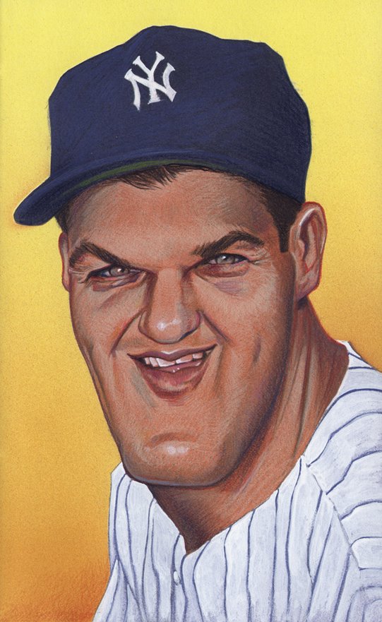
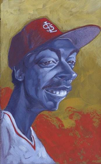
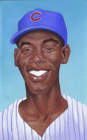
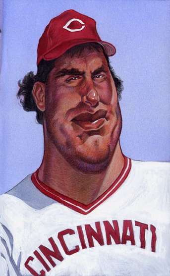
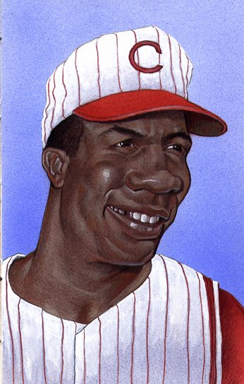
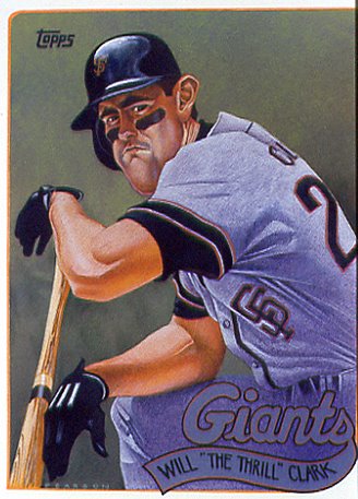
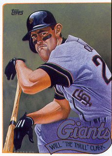
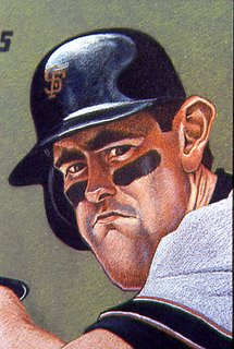
I'm a hopeless baseball fan, and I've been keeping a painted sketchbook going on and off for years now of just baseball faces. It mostly started with this piece, Will "The Thrill" Clark, which was comissioned by the awesome illustrator/entrepeneur Murray Tinkelman for his traveling exhibit of illstrations "The Art of the Baseball Card". I was honored to be invited to participate in the show, to hang on the wall with such great illustrators as (to name just a couple) Chris Payne, Bernie Fuchs, Bob Dacey, and Murray himself.
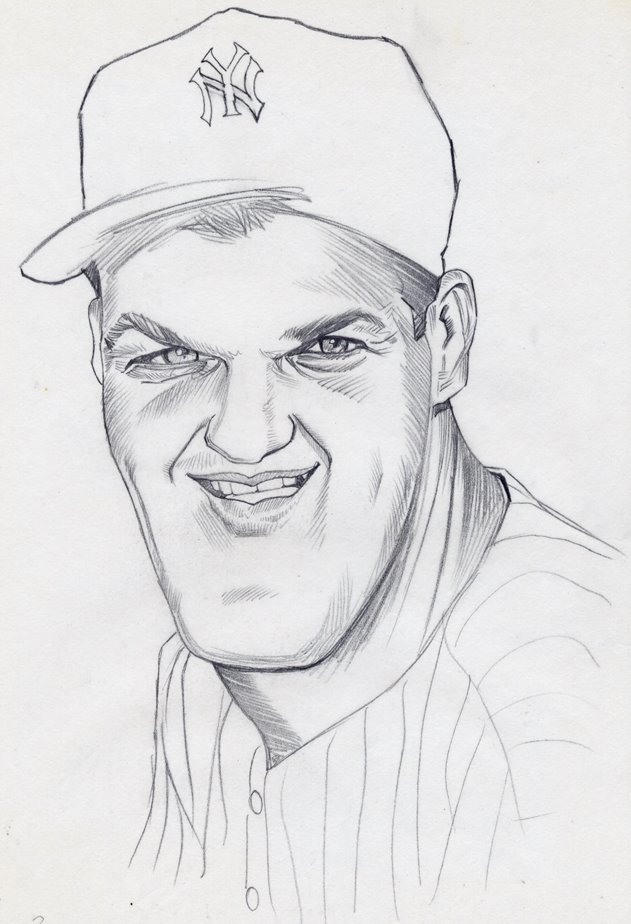
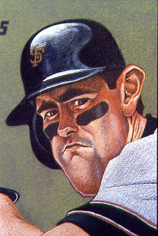
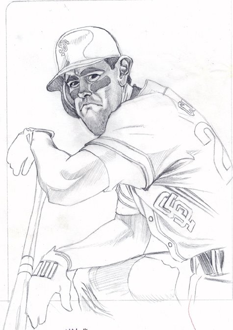
This was from a Topps card from 1989, the year the Giants went to the World Series (the Earthquake Series - they were swept by the A's. Bummer.) I think this is from a scanned slide, so the quality is a bit flaky. I'm including a scan of the pencil drawing on tracing paper that was projected via good old Lucigraph onto the preparred illustration board surface. I'd spray fix the charcoal underdrawing, then cut friskets and do the airbrush underpainting (also creating a nice tooth for the colored pencil to follow) then blend in billions of tiny sharp strokes of colored pencil till finished. Usually I'd pop some highlights on with acrylic or goache at the very end.
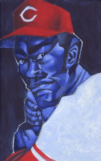
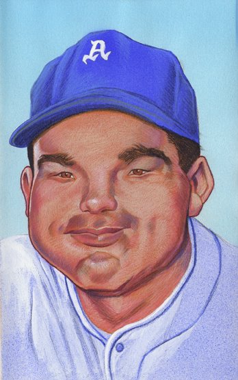
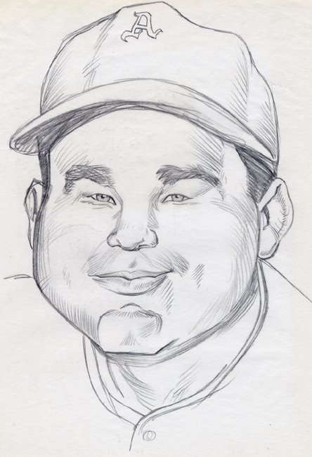
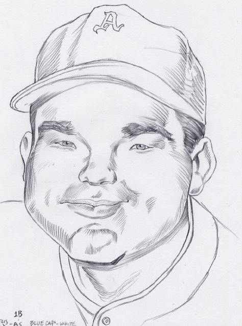
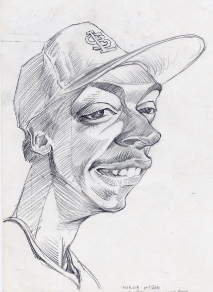
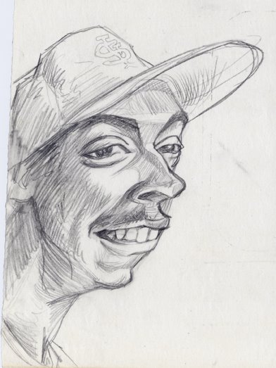
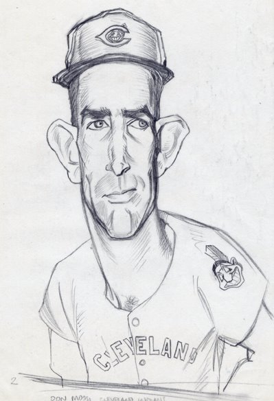
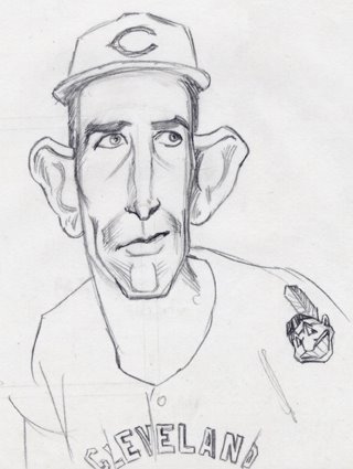
I'll post a few of my baseball heads sketchbook paintings next.

Monday, January 16, 2006

Dr. Watson


"Quick Watson, the needle!" In his original literary incarnation as well as the BBC/Jeremy Brett versions he was Sherlock Holmes' friend and colleague, rather than a mere sidekick. But the Watson as protrayed by Nigel Bruce in the Holmes movies of the 30's/40's was definitely more of a typical movie sidekick, providing comic relief rather than a conscience or a chronicler of the adventures. While certainly more dignified than your Barney Fife or your Ensign Parker, I think he qualifies as a slightly higher brow Hollywood sidekick.

Friday, January 13, 2006

Asta


Asta, famous four-legged sidekick to Nick and Nora Charles of the Thin Man mysteries, as well as frequent crossword puzzle clue. Who says all sidekicks have to be human?

Wednesday, January 11, 2006

Boy, I Wonder


Boy, I Wonder . . . what would Burt Ward (as in "youthful") have done with his life if it weren't for the BATMAN TV series? I'm guessing the answer is probably what he did after the show was canceled - umm - shopping mall openings and comic conventions. When it was originally broadcast on ABC, BATMAN was like religion, but so much better than church. I watched both half hour episodes every week and reveled in the costumed characters brought to life from the pages of my DC comics (or at least the highly campy, velour and sateen versions of the character's costumes. Some of the costumes were potential career killers - Frank Gorshin's Riddler costume, the skin tight green leotard - gutsy of him to say the least) in the personas of old Hollywood stalwarts like Burgess Meredith, Cesar Romero, Otto Preminger, Julie Newmar, Victor Buono - actors who would not have been on my radar without the show. Even though we still had merely a black and white TV (to this day I think a gritty BATMAN movie in black and white would be amazing - Sin City anyone?) and even though I knew the show was not quite the same Batman I was hooked on in the comics, I thought it was the Best. Show. Ever. while it was on (1966-1968).

Tuesday, January 10, 2006

"Gilligan, you f***ing Moron!"


Little Buddy indeed . . .

the fact that I used to actually watch Gilligan's Island every week (glassy-eyed with a thin line of drool I'm sure) speaks volumes - about my own lack of ability as a kid to discern between "funny" and "mindless" - about the level of sophistication that was network TV comedy for a couple of decades - and about the strange power of a cute girl in tiny denim shorts and a gingham top tied at the waist. mmmmmm . . . Mary Ann . . .

Sunday, January 08, 2006

Jay Silverheels RULES!


SIDEKICKS II

Here's another sidekick - the Masked Man's "Faithful Indian Companion" Tonto, aka Jay Silverheels. The sketch seemed a bit on the gaunt side so I thickened hima little in Illustrator.

Thursday, January 05, 2006

Sidekicks


"Sidekicks" project.

In another attempt to expand my comfort with Illustrator, I wanted to mimic a more graphic, stylized style of caricature I had seen in various magazines. My goal was to start with a fairly realistic drawing, scan it, bring it into Illustrator, then boil the image down to where it was just a series of flat color shapes, almost abstract. I had been working on a page for a website devoted to TV and movie sidekicks, hence the subject matter.
While I like the following bunch of images, I don't feel I abstracted them as much as I was hoping. First up: Mr. Spock - originally done on a cocktail napkin for a friend after too much vodka - with more trusty second bananas to follow.